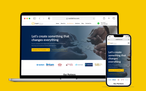
Your website is like your online home; it houses your brand, products, content, and more. But even if you’ve grown comfortable with your site’s decor, it may be time for a redesign.
As an experienced digital marketing agency serving businesses across Africa, we’ve seen firsthand how a website refresh can reenergize a brand’s online presence. Don’t assume your site is fine just because it’s functional! Here are five signs a redesign could better showcase your business, even if your homepage looks decent at first glance.
1. Your Site isn’t Mobile-Friendly
In today’s digital world, you can bet a huge chunk of your website traffic is coming from smartphones. We learned this lesson the hard way with a client two years ago. Their site looked sleek on a desktop but was a pinching and scrolling nightmare on mobile. After finally optimizing for mobile, their traffic and conversions spiked almost immediately!
Some clear red flags that your site is not mobile-friendly:
a) You Have to Pinch or Zoom to Read
This is a huge red flag. If text or images aren’t legible without zooming in, mobile users will quickly bounce to a better experience.
b) Horizontal Scrolling Happens
Needing to scroll side-to-side is also a major mobile UX no-no. It disrupts the reading flow and frustrates visitors.
Optimizing your site for mobile doesn’t just improve the user experience. With over 60% of web traffic coming from smartphones in Africa, a mobile-friendly site also helps you capitalize on the device your customers use most.
2. Your Design is Dated
Remember seeing sites with flash animations and dots connecting page links? Web design trends evolve quickly. While you don’t need to chase every fad, an outdated site makes your brand seem behind-the-times.
Some clear red flags that your design needs modernizing:
a) You’re Using Web Elements Past their Prime
Do images still pop up in separate windows? Does text run across flashing backgrounds? Do drop-down menus reign supreme? If so, some elements could definitely use retirement.
b) Your Branding Feels Stuck in the Past
Your visual identity may have moved beyond your site’s aesthetic. A refreshed design can bring better alignment. Don’t forget to match branding across platforms for consistency.
Web design should evolve with your brand. A revamped look reminds customers and prospects you’re modern, trustworthy, and worth their time.
3. Your Content doesn’t Engage
Even if the design is sleek, weak content makes for a lackluster experience. Here are some engagement red flags:
a) Content is Thin or Irrelevant
A superficial “About Us” or product list without descriptions signals it’s time to add value. Make sure your content directly serves your audience.
b) You Lack Visuals
We can’t stress enough the importance of visual content! Stats show articles with images get 94% more views. Videos, gifs, and graphics make your site lively and interesting.
c) Interactivity is Missing
Are you leveraging polls, assessments, calculators, or other interactive elements? These boost engagement and lead generation.
Useful, multimedia content makes visitors stick around and come back for more.
4. Your Site doesn’t Reflect Branding
Your website and brand image should feel cohesively connected. But sometimes websites end up disjointed from current branding.
For one of our recent clients, their redesigned logo and color scheme no longer matched the old site aesthetic. A redesign unified everything under their new visual identity.
Make sure your website aligns with and enhances your:
- Brand messaging
- Tone and voice
- Imagery
- Color schemes
- Typography
- Consistency strengthens recognition across digital properties
5. Conversion Rates are Low
At the end of the day, your website must convert visitors into leads and sales. If your metrics point to underperformance, a redesign can get things quickly back on track.
Some issues to look for:
- High bounce rates
- Short time spent on site
- Low lead capture
- Minimal sales conversions
Optimizing user journeys rectifies pain points. Clear calls-to-action, simplified navigation, persuasive content, and striking visuals turn more visitors into customers.
Refresh Your Online Presence
If you identified with one or more of these signs, the time is right to give your website a reboot. Even if you still like how it looks now, updates make sure you don’t get left behind as web design continues to evolve. A redesign can help your brand feel current, show off your offerings, and turn browsers into buyers.
Get in touch if you’re looking for help analyzing how your website is performing or want to discuss a redesign. We offer complimentary website audits and would love to chat about revamping your online presence.
Don’t settle for a website that just gets by; make sure your site delivers as a powerful brand amplifier!


